Tiny Accents
by Influxes • Uploaded: Nov. 06 '07

Float
(Floaters:
2 )
Description:
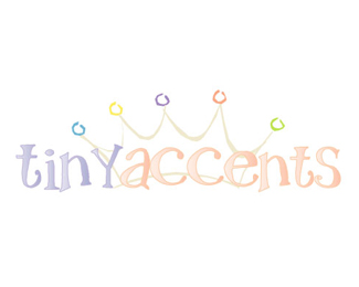
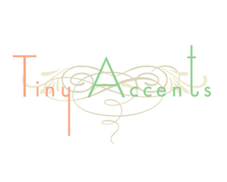
Online company providing baby accessories.The client had a specific idea in mind which changed several times during the designing stage :)Please critique.I am new to design and would love to hear your comments.
Status:
Nothing set
Viewed:
1222
Share:


Lets Discuss
I personally would prefer without the leaves either side of the bunny but regardless, I really like this design.*I would slightly modify one of the 'c's so the hand written look of the typeface would seem less mechanical.
ReplyI would leave the dashed border and move the typeface a little more to the bottom. Then it'll be great!
Replydache:*I have seen your designs.Your work is wonderful:)*The client really wanted a leafy, curvy design and the beige brown colour scheme. Personally, I feel the design would also look nice in pastels. You are right about the 'C's.Let me do something about that.**Yglo:*Your suggestion has merit.Let me see how it looks.
ReplyPlease login/signup to make a comment, registration is easy