Winebrokers 3
by IdentiFly • Uploaded: Apr. 11 '09

Float
(Floaters:
2 )
Description:
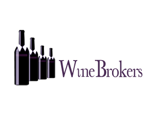
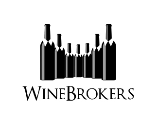
Logo proposal.
The company name is Winebrokers. This company provides the following:- Wine brokering, Brand Management, Wine Sales & Marketing advise & Wine sales support.
Status:
Nothing set
Viewed:
1424
Share:


Lets Discuss
This arrangement but the big W and B are really throwing off the clean line. Kerning is horrendous as well. Trajan is a challenge to kern correctly.
ReplyThanks. I liked the font, just placed it there to show it as sample to the client. I'm curious what he will like, revisions will follow.
ReplyAt first glance the bottles look broken. Have you tried five rather than seven bottles?
ReplyWith five bottles looks a little poor. I tried. The seven bottles help me with the perspective.
ReplySimplifying it to a 3 will work - Less is More :)
ReplyWith three bottles you could sell the %22W%22, right now the mark seems a tad forced. Start with one bottle and look at the shadowing...now how do I get two bottles to look nature but not overblend.
ReplyMaybe you could throw a tie in there somewhere....
ReplyThanks for feedback. I tried with few bottles but liked it less. The big number of bottles give this %22we are the professionals that are the best and stand out in this business%22. *Tried the tie at first but it was too much detail. Does look nice with red tie though, but not for this business.*W from three bottles .. yes, can be achieved, but that would be something just for the logopond eyes. Generally I try to avoid this scenario. I had other totally different samples with W incorporating two bottle silhouettes, much better, but didn't look as powerful as this.
Reply@identify: I think you're taking on a rather blinkered approach to this. These are all constructive comments that will improve your logo. The reason the bottles look broken is because there are TOO MANY OF THEM! If you concentrate on 3 of 5 bottles the collar detail will become clearer...REALLY!
ReplyRoy, knows what he's talking about. I agree less is more, you only need three and 5 at most to convey we.
ReplyPlease login/signup to make a comment, registration is easy