Advocate Magdalena Waśko
by INNVIA • Uploaded: Apr. 07 '18

Float
(Floaters:
1 )
Description:
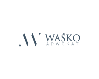
The sign was based on the owner's initials, the advocate Magdalena Waśko. The concept of form is to combine modernity and simplicity with majesty and tradition. So the project combines both initials and synthesizes them to the most simple form possible. This sign is very simple and at the same time it expresses not only the first letters of the first and last name but also the first letters of the words "advocate" and "victory". The logo also has a modern sheriff font theme in the form of triangles in bottom-left and top-right corners. Each element was selected so that a longer visual analysis of the sign would cause feelings such as stability, elegance, harmony and prestige. All this in a small minimalist signet.
made for contract with a company grafiqa.pl
As seen on:
Status:
Client work
Viewed:
1003
Tags:
elegance
•
prestige
•
gold
•
logo
Share:


Lets Discuss
Please login/signup to make a comment, registration is easy