Float
(Floaters:
2 )
Description:
New CI
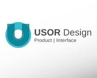
usor stands for: "user oriented"
Feedback Welcome
Status:
Nothing set
Viewed:
1607
Share:

Lets Discuss
Hi, need comment
ReplyJust thinking... I like the name very much, USOR, and what it stands for of course... But somehow i don't quite feel it in the mark... This typography may or may not be the right one, but I think that the mark should show it more clearly - connection with the users... I see it just as a game of the U and O letters, but it's more 'corporate' then 'design' looking... IMO...
Reply@ Type08, thank you for your comment%3B it is quite hard IMO to express the idea of %22user oriented%22 in a universal way, without using an iconic sign for %22user%22 (i mean a torso with a head or something like that).**Furthermore the sign should communicate the hole idea in a more open and playful way. The corporate aspect is also an important part, so i%B4m gald, that this aspect fits for you.**best regards, Hurricane.**%3EMore comments welcome%3C
ReplyPlease login/signup to make a comment, registration is easy