Description:
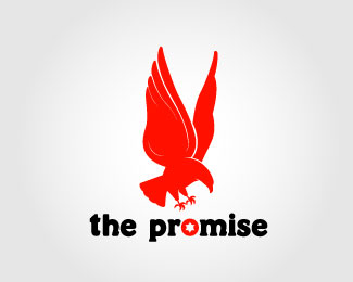
This logo is for a new company that makes clothing and accesories with christian messeges. So the eagle represents power and shrewdness in the Bible.
Status:
Nothing set
Viewed:
2927
Share:
Lets Discuss
I find something a bit off about the wings!... just not dynamic enough. or too pigeon-ish.. they may be eagle wings.. but they just dont look it... plus if your going to use an eagle as a mark my suggestion would be to make it so its unlike any other eagle logo (%26 theres a lot) ... you got skills though.. thats apparent.
ReplyHi nido, thank you for comment %3B)%0D*%0D*Well i'm not so good with english, so what is pigeon-ish? And yes i was not so sure about the wings, they need more dynamism, that is right, thanks!%0D*%0D*I was trying this position of the eagle because it has to %22grab the promise%22 or something like that, and that's what the client wants. Or maybe something diferent in the line style? What do you think? Well this is in process al though, so i'll be comming soon :)%0D*%0D*Saludos!
ReplyHey Honey Bunny... your English is great...**pigeon-ish just meant they look like pigeon wings.. not saying they are but the lack of dynamism makes them look too bland for eagle wings... i agree, try something different in the line style!.. good luck honey...
ReplyPlease login/signup to make a comment, registration is easy