Description:
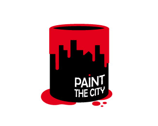
For a magazine in my school that deals with design-related topics. ©Rodolfo Carrillo
Status:
Client work
Viewed:
12236
Share:


Lets Discuss
Beautiful Rodolfo, love the simplicity but strong brand!
ReplyThanks Rodolfo! Im really glad you like it
Replylogoboom, rokac, lalohead and of course rudy, thanks for the float!
Replyi really like this..great mark
Replythanks dotflo! and may I just say your gallery is superb! :)
Replymomentum, dotflo, climax, pajga, mikeyn, i appreciate your vote :)
Replynima, thanks for the float
ReplyThis is a great mark mate, is it me, or the mark is slightly wider than the type? I'm not really sold on the balance there, type-mark, nonetheless i really like it.
ReplyI see what you mean, they're supposed to be same width but the eye doesn't always agree with geometry i guess, i'll check the .ai anyways, and thanks for your comments lecart, they mean a lot!
Replynice, smart solution :)
Replythanks alex :)
Replyreally like this one
ReplySimple and nice :-) likey
ReplyAndrea and Bharat, thanks for your comments I really appreciate it.
ReplyHey, great logo. Very clever yet not overdone. Well done. ha
ReplyGreat mark, I would try and balance the weight of the type and mark a bit more.
ReplyBrion and Richard, thanks for the input guys!
Replyawesome.
Replyslight update: heavier type :)
ReplyGlad you like it, Nash!
ReplyPlease login/signup to make a comment, registration is easy