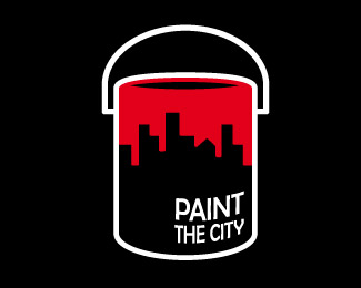
Paint the City v3
by HitByReindeer • Uploaded: Aug. 11 '09

Float
(Floaters:
18 )
Description:
seen lots of city silhouttes lately, thought i should pitch in :)
---
edit: third attempt!
Status:
Just for fun
Viewed:
7800
Share:


Lets Discuss
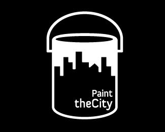
This works quite well. Have you considered curving larger type around the tin so it looks like part of the label?
ReplyI like this, but with firebrands idea will look even better!
Replythis is a solid concept just needs better execution and better typo
Replythanks guys for your kind words and advice :)%0D*%0D*firebrand: thanks for the suggestion, i'll give it a try and update as soon as i can!%0D*%0D*DDD: i know there's lots of room for improvement, but i'm more than eager to learn, do you have any suggestions type-wise?
Replywhat a grand concept.
Reply**updated with firebrand's feedback! better? worse? not at all what you had in mind? :P do tell!
Replylogomotive said: %22what a grand concept%22.**Thanks man, it's thanks to you that I could ever come up with this, your work is one of the most inspirational ones I have been lucky enough to witness.**cheers!
ReplyGlad to be of inspiration. I think the type is a bit big? I actually thought the overall design prior to this had more impact? the Type tucked in the corner made me look at it and read it easy. I think I actually preferred the prior one myself. But Roy knows what he's talking about too.
ReplyMaybe post the other up so people can compare? I think this logo could work for a few things to do with Painting the city.
ReplyI like the caps and the curvature. Maybe smaller, bold condensed, ranged right as before.
ReplyGo back to the original type lockup and positioning but follow the curvature of the can.
ReplyI also agree that it needs some work, but like where its going. As an added thought why not make the paint a nice 'red' then it would give it another ahhhhh! factor. As in paint the city / town ... red.
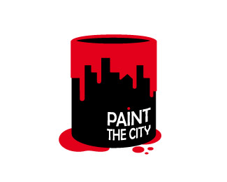
Replyok third time's the charm!**thanks guys for all your feedback, I tried to incorporate all your suggestions into this one.**thoughts?**@NeilMcDonald: I'll upload the colored one in a minute :)**
Replyalmost :) I think it's almost there. Look at distance from bottom of can to type (black area and curvature ). also for some reason I want to drag it back to left a little more seems too close to border. Go same black area around the type.
Replydamn! nothing gets past you :D**ok, i'll get back to work then!
Replybetter now?
ReplyMe gusta m%E1s la versi%F3n roja y blanca. Pero el concepto est%E1 buen%EDsimo!
ReplyPlease login/signup to make a comment, registration is easy