Float
(Floaters:
0 )
Description:
Logo used for personal website.
Status:
Nothing set
Viewed:
1703
Share:

Lets Discuss
Hello everyone. I'm new to logo design and I really could use any critiques and tips you may have to help me improve. Thanks.
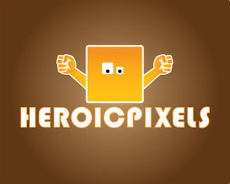
ReplyI think that is a good idea, but it might be a bit improved. The hands look too realistic for a funny character like that. There are also too much details in it, which would be lost in small sizes. The wordmark is too close to the illustration, and maybe even the font could be adapted. The %22C%22, for exemple, looks like a %22O%22. In small sizes, it will look even more. However I think that is a good start. We usually need to draw dozens or hundreds of concepts before to get at the final logo. Good luck and welcome!
ReplyThanks for the advice gustavocadar. This was one of the first ideas I have tried, so I will try to flesh out more of my ideas for this. I'll go back and try the improvements that you suggested. Thanks again for the critique. I really appreciate it.
ReplyPlease login/signup to make a comment, registration is easy