Description:
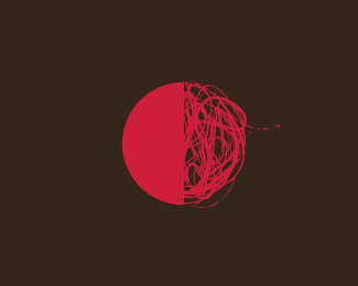
Inspired by the idea of a balance between an algorithmic approach and an artistic approach. Work in progress.
As seen on:
http://www.helveticbrands.ch
Status:
Unused proposal
Viewed:
3235
Share:

Lets Discuss
I'm intrigued.
ReplyLove the feel of this!
ReplyThanks guys. I am pleased to say the client has just confirmed this is exactly what they need :%5E)
ReplyCool stuff, love to see it in action %3B)
Replyhaha... i did a very similar thing just yesterday with a square... not what my client wanted though...
ReplyThis is interesting, and for me, WORKS.
ReplyBeautiful!Just perfect! :)
ReplyI appreciate the feedback, thanks.
Replycool stuff, it reminds me of fractals.
Replynice to see you here too, i've been watching the work posted on your website and it was love at first sight.just wanted to pass by and to say i only got love for your work.keep up the clever work !*c u a o .
ReplyPlease login/signup to make a comment, registration is easy