Description:
Work in progress. Constructive feedback welcome.
As seen on:
http://www.helveticbrands.ch
Status:
Unused proposal
Viewed:
1800
Share:


Lets Discuss
How would you improve on this?
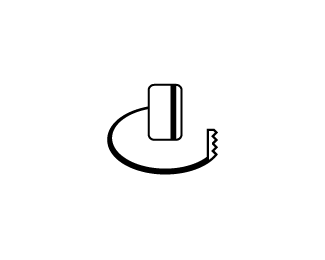
Replythe saw like object doesn't seems to work for me... it looks like %22the credit card got a saw to rob other people%22. Maybe some description about the project and what you're trying to achieve?
Replymakes perfect sense to me... no suggestions... now to the proverbial...
ReplyI would lay the card flat on the surface and fix the direction the saw is pointing at. Right now I am seeing an ID/security card on a string with a clip on the other end.
Replytotally missed the concept.... maybe instead of having the cut line start right behind the card, have it start the the 2 o'clock position? so it looks like it's almost completing sawing the hole, and the cut line won't looke like a string attached to the card... also maybe the cut line can be finer and the saw seems like can be wider on the bottom, so it doesn't look like a key?
Replymakes perfect sense to me too. If anything, the angle of the saw blade doesn't quite match the cut?
Reply%5EExact same comment. Really fun idea! :)
Replyperspective..
ReplyI would agree with showing the card laid flat with perspective for both card and saw.
ReplyThanks to everyone for the great feedback. Unfortunately this direction will no longer be continued as the client and myself feel it may have too much of a negative connotation.
ReplyPlease login/signup to make a comment, registration is easy