Description:
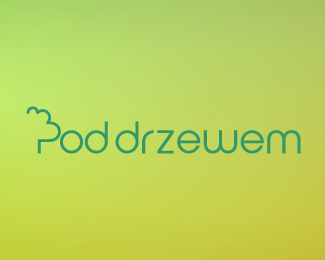
Pod Drzewem is a training and consultancy company, based in London, which delivers services to IT companies. The name is of Polish origin and translates as “Underneath a Tree”. The client wanted a modern and flexible yet solid and professional logo therefore I took inspiration to create a “P” representing a tree and created a custom typeface for the remaining characters to give this small company an edge over its larger competitors. The result is very easy on the eye and reflects their approach to making out-dated processes simpler.
As seen on:
http://www.dache.ch
Status:
Client work
Viewed:
1460
Share:


Lets Discuss
Please login/signup to make a comment, registration is easy