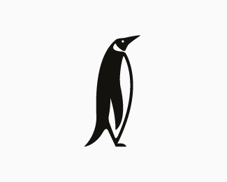
Description:
Designed for a conservation organisation. Work in progress
As seen on:
http://www.dache.ch
Status:
Nothing set
Viewed:
4091
Share:


Lets Discuss
Thanks s.k_da_designer !
ReplyLooks quite a lot like the penguin books logo at first glance
ReplyJayKay : Interesting comment. I believe they are quite differant, have another look at the penguin books logo.
ReplyOK, I meant it's a similar style of illustration (thick black strokes etc) and obviously resembles the penguin books logo as it is a penguin. You're right they are different enough, but in a world like this - http://www.brandrepublic.com/BrandRepublicNews/News/799955/Apple-takes-New-Y you can never be too sure!
ReplyI believe the illustration styles to be sufficiently different as penguin books has a hand drawn appeal to it whilst my creation is more angular and geometrically aligned. The fact that this penguin is a side view and the books one is at 3/4 is also its strongest difference. Thank you for the interesting read.
ReplyI love this illustration. It's the negative space that keeps it in balance. It's perfect.
ReplyThanks millron!
ReplyPerfect
ReplyPlease login/signup to make a comment, registration is easy