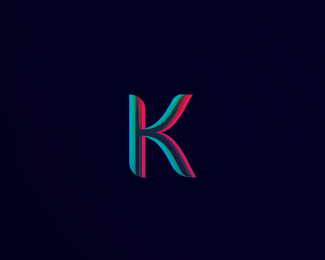
Description:
More info on my website : http://www.dache.ch/
As seen on:
http://www.dache.ch/
Status:
Nothing set
Viewed:
3816
Share:






Lets Discuss
David, this is seriously slick! Why didn't you put the version with the type (as on your site) here on logopond?
Replygreat one bro
ReplyI think you should upload the full logo Dache. Nice work on this one.
ReplyI like how it appears to catch the light from two sources to create the 3d effect.
ReplyIf I ever need a new personal brand, I'm stealing this!! :-P Nice work, David.
ReplyThank you all for the positive feedback. I will consider putting up the entire logo :%5E)
ReplyYou always have amazing colors.
Replyvery nice %26 catchy one..%0D*I like it.
ReplyThanks guys glad you like :%5E)
ReplyNot bad, not bad at all. One of your most original to date.
ReplyHey Chanpion thanks. Feel free to float if you like it :%5E)
ReplyThanks for the comment, however I am sure the other participants of this website will agree that we post each logo for it's individual merits and do not expect it to be compared to our entire portfolios. I find your new approach of comparison interesting however in this case I think old school rules :%5E)
ReplyHave to agree with Dache, that each logo should be judged on it's individual merit. I often wonder what would happen if logo's were posted temporarily without anyone knowing who the designer was, I believe there would be a lot more honesty about what people actually thought of the design. Sometimes people can be either too begrudging or too pally to one another, which can get in the way of honest critiques.
ReplyHey Terry, that would be quite fun to see :%5E)
Replyyes.. that would be fun!... but i think that certian people on here have an instantly recognizable style... not saying thats a bad thing, but im sure others would disagree... i like what you have done here dache... but i think had you added this anon with the type next to it as you have on your website then my first impression would be that its yours.. kinda like what climax was saying.
ReplyIf I posted it here anonymously and had the same version on my website it wouldnt be that hard to know who created it :%5E)*This site is more about the creation and its individual merits though.
Replywe only visit your website cause you dont give detail here... :%5E)
Reply@Climax - My 'begrudging or pally' comment was never specifically pointed at anyone in particular and certainly not specifically at you, and I apologise if it seemed that way. I think everyone does this 'begrudging or pally' thing at some point in everyday life, its natural to be nicer to someone you appreciate or more grudging to someone who you may not appreciate, for whatever reason good or bad. I was just thinking that anonymity allows for true critique as your opinions cannot be swayed by any feelings good or bad. This has nothing to do with Dache's logo or any other I've seen, I was just stating a fact that came into my head at the time. It came across differently than I meant it. I agree whole heartedly about improving ones craft, I'm here to learn! Maybe I'll change my tag to 'Grass Hopper'!
Reply%22You should take this as a chance to improve your craft, not a knock.%22**I see what you mean. I have explored as much artistic freedom as possible within my brief. My client and I are very happy with the result in any case. Thats what counts right?**I do attempt with every logo to use a different style or approach. Its not really about reinvinting ones craft every time though.**%22Don’t try to be original, just try to be good%22. - Paul Rand*Sure, the text uses bold and regular thickness on its letters and its not reinventing typography by any means, but it works.
Reply*Do or do not - there is no 'try'**Yoda
Replynido is that you? :%5E)
Replywhere?
ReplyPlease login/signup to make a comment, registration is easy