Description:
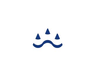
A branding variant of the NUEYS identity created for a line of childrens clothes.
If you are not aware of the project more info can be seen on my portfolio about it all.
As seen on:
http://www.dache.ch
Status:
Nothing set
Viewed:
4511
Share:

Lets Discuss
Pretty cool, nice family feel **Like the mouth just wondering if the leaves could have been integrated for the eyes ... but stilll very consistent
ReplyIt looks too forced and out of place.
ReplyThanks for comments.*That is a rather unfounded statement senter, I am open to constructive criticism only thanks.
ReplyHow is that not constructive?? If someone said that to me, I would look at the design over again and try to understand their statement.
ReplyIt is not a constructive critic for it has no argumentative structure.
Replydache what? you sure don't practice what you preach
ReplyAgain, this is an unfounded statement . No need to be personal either.
Replyi think the eyes make it look less homogenous ...
ReplyHmm. If the eyes were the shape of the leaves, as you suggested, it would like too much like a feline.
Replyin all fairness dache, a lot of your criticisms fall flat of constructiveness, not ALL... but lately... a LOT! its like you only have time to write one sentence... %26 then run! try sticking around, someone of your calibre can be very helpfull if they wanted to...
Replyhmm ya reckon ... not to sure on feline but think thats whats giving the forced feel ...
ReplyDesign is subjective. The two best designers in the world might look at this and one might say, %22Wow, I love it. It's perfect%22. While the other one might be looking at it in an entirely different perspective and say, %22It needs a lot of work%22...or %22it looks forced%22. Take it with a grain of salt. If you stand behind your design, it shouldn't matter what others think. We all know you are talented, but we all have a lot to learn. So, LEARN! And in my honest opinion, while I love the concept, it does seem a little forced. The eyes seem off. All in all though, I think you are a design genius. :-)
ReplyPlease login/signup to make a comment, registration is easy