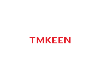
Logotype
by HelveticBrands • Uploaded: Apr. 12 '10

Float
(Floaters:
12 )
Description:
Bespoke typography for
تمكين. Work in progress.
See the latin version here .
As seen on:
http://www.helveticbrands.ch
Status:
Client work
Viewed:
1977
Share:


Lets Discuss
Here are the two versions side by side as seen on the %3Ca href%3D%22http://twitter.com/helveticbrands%22%3Ehelvetic brands daily on twitter%3C/a%3E**!http://www.helveticbrands.ch/images/tmkeentype.png!
Replymaybe apply some of the rounded edges you have on %22tmkeen%22 to the arabic version... thats if you are considering using that for the logo too?...
Replyoh wait... i think you have... have you?... hard to tell... i need glasses...
ReplyThanks for the taking the time to comment nido, it is appreciated. Indeed they both have the same identical rounded edges. Common elements can be seen in the top right of the Kaph and the crossbar of the T for example.
Replyim impressed with your mentioning %22kaph%22... tell me... how much Arabic did you know prior to this if any... and how much did you study of it during the process?
ReplyDuring my time in art college we had the opportunity of having access to typography workshops, in which Arabic and Cyrillic alphabets where the main focus. There are some truly fascinating things to be found outside of the Latin alphabet.
ReplyAlthough I can't read this version (as a language), I find it far more aesthetically pleasing as a graphical mark than its latin counterpart.
ReplyThanks Josh.
ReplyPlease login/signup to make a comment, registration is easy