Float
(Floaters:
2 )
Description:
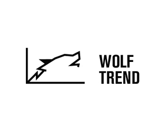
Unused concept for a market analyst software company.
Status:
Nothing set
Viewed:
1468
Share:




Lets Discuss
good CONCEPT, The wolf is a little hard to see at first
ReplyGood concept, good idea. suboptimal practice.*one doesn't see any difference between the GRAPH and the x-y-axis, because they got the same weight.*A graph never goes back. so one can hardly recognize both the graph AND the wolf.*Unfortunately, theres no typography in %22Wolf trends%22 to say anything about microtypography... but obviously there's something wrong with the kerning and the line-height in relation to the font-size. *With what program you created this Logo? For good Typo i would recommend Adobe Illustrator or at Least InDesign. *The space between the symbol-brand and the word-brand is too big to associate them together to a %22word-symbol-brand%22...
ReplyUse two different colored lines in your graph and weave them to make your wolf image. You'll get a bit more detail but will be able to avoid going back as Yummie pointed out is not done on graphs. There is no reason why the ears can't be pointed forward. And there is nothing written in stone that the wolf has to howl either to be an effective image.
ReplyPlease login/signup to make a comment, registration is easy