GVP eye2
by HelloUriah • Uploaded: Jun. 22 '08

Float
(Floaters:
2 )
Description:
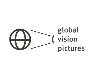
Global Vision Pictures; Australian film company.
Complimentary type suggestions welcome.
Status:
Nothing set
Viewed:
3049
Share:


Lets Discuss
The shapes within the globe don't seem to match each other. Have you zoomed in and made sure everything aligns properly?
ReplyI agree. However, I like the boldness of the dark color in the logo. My only problem is that its not balanced proportionally (what OcularInk said), and the portion of sea-green at the middle towards the bottom does not correspond with the rest of the blue in the design. But I think you are on to something. It looks like it will come out to be a good logo in the end. Good luck mate!
ReplyOcular: It does feel a little off.*Soap: I'm worried that if I make the colours to contrasting, it will be to much of a disco ball however fun that would be doesn't really fit with the brief. That sea green one stands our a bit to much, maybe I will reduce it to two or three. **Any type suggestions? Meta looks nice, Thesis Sans has a really open feel with large counters matching the globe. **Should I put this up at the forums?
ReplyPlease login/signup to make a comment, registration is easy