Float
(Floaters:
3 )
Description:
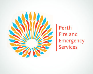
Redesign for Local Perth Fire department.
Status:
Nothing set
Viewed:
3855
Share:


Lets Discuss
The mark is great, but the scale is off compared to the type, IMHO.
ReplyToo large? I didn't want to lose any of the detail. But I agree, and I'm not happy with the type treatment.
ReplyI think this might be one of those cases where the mark is over-designed and overpowering the typography. I would simplify the mark and enlarge the type.
Replythanks admarcbart, I agree, the typography is dwarfed by the marks's complexity, I prefer the mark just by itself with no typography.
ReplyLike it loads %3B 9
ReplyPlease login/signup to make a comment, registration is easy