Compens
by HayesImage • Uploaded: Apr. 29 '19


Float
(Floaters:
6 )
Description:
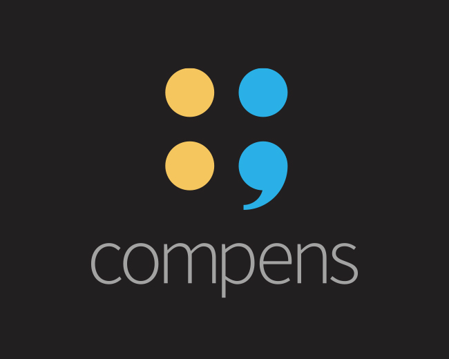
Brand design for Compens, a finance start-up, the name is shorthand of the word compensate. The mark is an abstraction of funds on the left coins & empty space on the right.
The mark is also a colon followed by a semicolon, while such a pairing would never exist in grammatical usage: their primary functions convey the concept.
• A colon links a sentence by a general topic followed by the topic explained in more specific terms i.e. Request for funds: specific use of funds.
• A semicolon links two complete sentences together that may be too closely related for a full stop i.e. We have funds available; they could benefit from our funding.
The tail of the semicolon leads the eye back to funding, implying the ongoing nature of the payment plan.
Status:
Client work
Viewed:
3,990
Tags:
yellow
•
cyan
•
grey
•
return
Share:


Lets Discuss
Please login/signup to make a comment, registration is easy