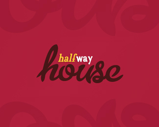
Description:
Concept for a convenience store and fast food development situated at the “halfway mark” on the Perth-Bunbury freeway. (2011)
Status:
Just for fun
Viewed:
3141
Share:


Lets Discuss
isn't the name a bit depressing though?
ReplyAgreed%3B though can't change client's name, the design does nothing to offset any negative connotation. IMHO, the design is chaotic, not reassuring. And I'd like to think with a name like that, one would like to reassure the viewer.
ReplyArt is in the eye of the beholder as is logo design. BTW how did this get %22gallerized%22?
ReplyI like the 'House' type.
Reply@bitencourt - looks like 'house' was live traced from a metroscript type example
ReplyI like it but it seems like there's too much going on.**//Jenn @ a %3Ca href%3D%22http://www.integraphix.com%22%3ECreative Agency%3C/a%3E
ReplyI'm just as surprised that this was featured, not my favorite though still flattered.
ReplyI like the house type too, but Mike's questions remains :)*
ReplyHaving once worked at a Substance Abuse and Addiction clinic http://www.drneilbeck.com I find this in very poor taste. I would suggest trying to leed the client into a renaming like %22 Half-time House%22 or something similar. I travel that road often...to the pot of gold called Marg's
ReplyPlease login/signup to make a comment, registration is easy