Description:
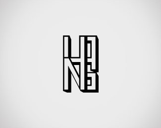
This is a process shot. I am just starting out designing logos and wanted something memorable, yet simplistic for my name. Hans is not the most creative name out there, so this logo should show what i can do. Wondering if it is legible enough, what do you think?
Status:
Student work
Viewed:
1838
Share:
Lets Discuss
Please login/signup to make a comment, registration is easy