Float
(Floaters:
13 )
Description:
Brooklyn-based environmentally conscious painting company.
Status:
Client work
Viewed:
1507
Share:


Lets Discuss
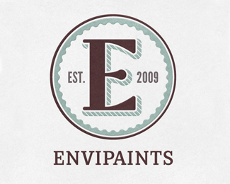
Hmm, not really feeling this one. I realize that you're trying to pay homage to industrial logos of the past, but compared to today's branding standards, it just doesn't have enough visual interest. Also, the mark doesn't do anything to communicate the %22painting%22 or %22environmentally-conscious%22 angles.
ReplyThank you for your comments. For this particular mark the client specified that even as an eco-friendly company, he didn't want the logo to follow suit with so many of those trendy green logos you see these days. I preferred to take a more subtle approach to reference %22painting%22 through the droplet I created in the E. Perhaps too subtle?
ReplySorry Anthony (and to you, Brian)%3B I wasn't trying to be mean with my comment before. I simply meant that today's logos tend to be a lot more clever, or unique, or target-driven than logos from generations past. In the '20s, for example, a brand's logo with a big 'E' as the focal point would've been perfectly acceptable. But compared to what's being done in logo design today, it really isn't enough. There needs to be something more%3B a deeper concept. Take your A logo, for example, Anthony. It's not just a sans serif A%3B it's an A that forms an L in the negative space. There's a clever concept there. Brian, I didn't notice that the cross bar of your E forms a paint droplet. I just saw it as a stylized E. However, now that you've explained it, I get it. But perhaps it's a bit too subtle. Maybe you can tweak it a bit so that it's more 'droplet-like.'
ReplyNo reason to apologize. I appreciate hearing feedback. Personally, my own aesthetic is inspired a lot by design of the past. I also like to focus mainly on typographic elements since I often create my own type. As simple as it may be, I tend to create my logos with a whole branding scheme in mind and that's where the concept comes in for me.
Reply**I dig it...
ReplyPlease login/signup to make a comment, registration is easy