
Float
(Floaters:
0 )
Description:
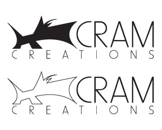
My own "company" logo
As seen on:
Cram Creations
Status:
Nothing set
Viewed:
575
Share:
Lets Discuss
What is that thing supposed to be in the upper left - an animal of some sort? I'm not getting it. I also don't know if %22CRAM%22 is the type of word I'd want to use for a designer's logo. It gives off a very negative connotation.
ReplyI have to agree that this is a bad logo. It is confusing and I read it as CREAM rather than CRAM when I first saw it. The gradation in the bottom type is bad. I'm sorry. I usually have at least something good to say, but it breaks too many rules, is not adaptable enough and doesn't make any sense. Would a potential customer see this logo and be moved to contact your company? They might call to find out what the black and white thing is. Well I guess that is something.
ReplyPlease login/signup to make a comment, registration is easy