Description:
This is a repost made changes from your feedback, thank you.
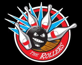
Logo for local bowling team. Design will be used for a black t-shirt. Look for some feedback
Status:
Nothing set
Viewed:
1810
Share:


Lets Discuss
The logo looks good but...I'd like to see at least one of the pins fly out more than the others to add interest - the far-right pin would be my pick. I also don't think you need the gray lips(?) around the mouth. Instead, I would just make the inside of the mouth a gray tone instead of black. And the eyes look more cross-eyed than mean. Finally, consider making the alley floor look more like wood by using a beige color - I think it would help convey %22bowling alley%22 more.
ReplyI have two suggestions:%0D*%0D*Choose a different font and treatment here. It doesn't work with the graphic.%0D*%0D*Turn the mouth around on the bowling ball. The ball seems to be powering forward and the mouth appears to be going the other way.%0D*%0D*The rest of it works well for the application you described.%0D*
Replythanks for the feedback, I am trying to make the changes now, What font would you recommend?
ReplySomething not as fancy - because the graphic is so strong.
ReplyMade some of the changes you guys suggested, the client want to keep the font style. thanks again!
ReplyI think you are almost there.**My last tweak would be to make the bursts more random (not all the same size). The size seems to mimic the pins.**Remember the ball is not hitting each pins at the same angle.
ReplyPlease login/signup to make a comment, registration is easy