Float
(Floaters:
6 )
Description:
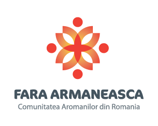
Identity proposal for a macedonian community from Romania.
Status:
Nothing set
Viewed:
6033
Share:




Lets Discuss
Salut, romane! :)
ReplySalut si tie.
Replynice mark, but the type doesn't fit the style of the mark and is disconnected. Also the lower line of text would be illegible in smaller applications
ReplyI kind of agree, the font is not quite the best solution ( it was suggested ).*I'll try to make some changes.*Thanks.
ReplyE misto sigla, dar fontul nu imi place! **The mark is fine, I dont't like the font!
ReplyThe font does not match the mark. However there are a couple things on the mark. When you rotated the people to create the shape you lost all depth because of the multiple gradient angles. Either pick a angle for all of your gradients to follow, or loose them. It distracts the eye and forces you not to focus on the mark as a whole. Or even better yet loose all of the gradients all together. You can still achieve the look with the overlays you already have.
ReplyThnks for tips guys.*I just update it, what do you think ?
ReplyPersonally I would go with a nice and clean sans serif.
ReplyI like the logo, but I too think you can lose the gradients and just use the overlays. Also, in regards to the font choice, your logo mark has sharp angles and circles. Maybe try something along the lines of Avant Garde, Futura, or Century Gothic. Doesn't have to be one of those, but something along those lines might look nice.
ReplyVery nice mark. Sorry to say that I don't like the type too... Not enough style for this mark...
ReplyThe mark is nice, but I agree on Ocular leaving out the gradients and use overlaps instead.*The type is lovely.
Replyfrumos :D
Replybravo graft!*vad ca se poarta romanii pe logopond.**though... i don't understand the connection between the symbol and the name. what represents that symbol (although i like it a lot)?
ReplyReminds me of this. But I see this everyday. So maybe that is why.*http://www.logolounge.com/wd/uploads/181_covenant2.jpg
Replybeautifullllll, i like it!
Replyfain,fain
ReplyPlease login/signup to make a comment, registration is easy