Description:
The first time post of a long time lurker.
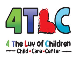
This logo was just chosen for a local daycare with a funky name.
Status:
Nothing set
Viewed:
358
Share:
Lets Discuss
Not totally sure of the rules of engagement here but I would still appreciate any feedback on this logo as my client likes this. But I would still like to make improvements where possible.
ReplyI think that there is too much stuff going on there. It has 3 symbols, 2 phrases and 1 logotype, 5 colors and 2 bars without meaning. You could take those 2 phrases out and just leave the logotype with a different typography, maybe the one used in the %22child ♥ care ♥ center%22, and rethink the color pallete choice
ReplyPlease login/signup to make a comment, registration is easy