
Description:
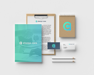
Logo + branding for Always Care Consulting. By encasing the 'c' withing the 'a' the icon reflects protection while remaining friendly and professional. The colors also give it a fresh and modern feeling.
Status:
Client work
Viewed:
959
Tags:
firm
•
clean
•
crisp
•
sleek
Share:
Lets Discuss
Please login/signup to make a comment, registration is easy