Description:
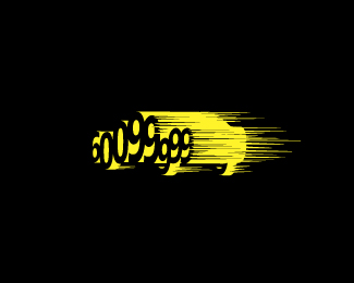
The client wanted a logo for his rental service hotline with the number part of the car.
Status:
Nothing set
Viewed:
1164
Share:





Lets Discuss
Unusual. I%60d might only lose that small horizontal black line on the 3rd 9 (lower part). It should be more legible. Besides, you don%60t need it, it%60s a wheel anyway and shouldn%60t be transparent. Just a thought..
ReplyYeah I will try that, thanks a lot really. But doing this logo is harder than it looks. Now that I'm looking at it again you have a point. *
ReplyAnd it might be cleaner without all the motion lines. Also, a straight side-view might be best for legibility.
ReplyYeah maybe but I tried side views it just doesn't work properly
ReplyMotion lines comming off the back of the car/numbers maybe. Neat tho, I like 3D stuff.
ReplyPlease login/signup to make a comment, registration is easy