Float
(Floaters:
2 )
Description:
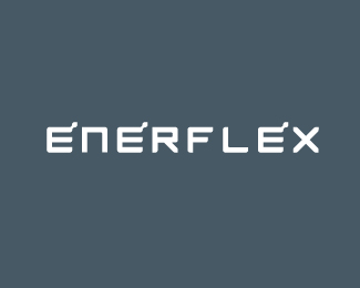
A Logotype for a company that sells petroleum machinery and tools.
Status:
Nothing set
Viewed:
1158
Share:





Lets Discuss
I am thinking it looks really strong. I think that if the %22F%22 had the same flare and the letters were tightened up a bit more it may balance it out a bit ?%0D*%0D*Top work anyway :)
ReplyThanks. Yeah I had the same feeling at first but then I tried to tighten up the space and the flare on the E looked almost touching the letter next to it. I tried around three spacings but they looked awkward so I went with this one.
ReplyMight wanna look some more into the FLE kerning
Replyhard to imagine how you can overlook a major spacing issue like that GR82**ENERF L EX**I like the dangling glyph on the E, but three times is too much for my eye
ReplyRaja, thanks for the kind words! :) I will see what I can do about it.
ReplyPlease login/signup to make a comment, registration is easy