Fireside Draft
by Fireside • Uploaded: Jun. 13 '09

Float
(Floaters:
4 )
Description:
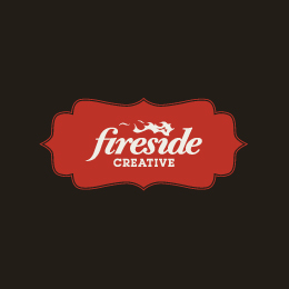
Fireside is re-branding. We are going for a simpler image with fewer embellishments, we even want to lose the flame. Our hope is that a singular (square image) that could brand all of our many projects, styles, and promotions will be a smart move. What do you think??
Status:
Client work
Viewed:
1320
Share:
Lets Discuss
A strong and solid, yet with a creative edge. That's the feeling i get from this logo. Good work.
Replythanks iamthez, thats what we are going for. Anyone else?
Replymaybe you tried this but what if you made the i in side and upsidedown !... that give it a little more ...something... :) nice work though, i like it nice and clean
Replyi like the way this looks! nice!
ReplyPlease login/signup to make a comment, registration is easy