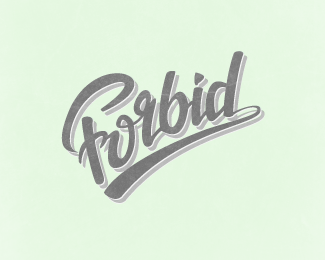
Forbid.
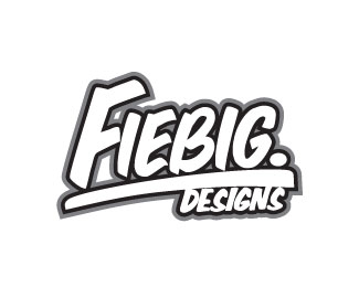
by FiebigDesigns. • Uploaded: Oct. 26 '11

Float
(Floaters:
4 )
Description:
Just a play around to try and make a nice looking script logo. Still a work in progress, critiques are appreciated!
Status:
Work in progress
Viewed:
1484
Share:

Lets Discuss
I know that there is still a lot of work to be done on this before it looks right, but i'm just looking for some constructive criticism to help me out! Thanks in advance guys!
Replynice lettering Mr. Fiebig ... what looks a bit strange is the hook on the F ... seems to me like a mixture between an F and a P ...
ReplyI would suggest making the top (horizontal) line of the r a little longer, just to make it more obvious.
ReplyHey thanks heaps for the comments! Yeah originally the hook of the 'F' was a little longer so it looked a lot more like a P so I reduced it a bit but I will change it more thankyou! The r has been bugging me i tried too fix it but wrecked the balance, I will give it another shot thanks!**
ReplyPlease login/signup to make a comment, registration is easy