Description:
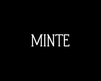
WIP (?) Just fooling around with type to rest my mind. This came to be and liked it. Thoughts welcome.
Status:
Work in progress
Viewed:
1994
Share:






Lets Discuss
Yes, actually that's a common problem with me whenever trying to create an M... I need to keep playing with it and find a way to fix that.**Thanks ! :)
ReplyI actually kind of like the wide 'M' %3E Gives it a unique feel... Plus M's rule of course %3B)
ReplyHeh thanks Michael :)
ReplyThanks Anthony, updating a fixed version later tonight :)
ReplyUpdate: Many small things fixed and others changed. Thoughts welcome.
ReplyDepends on what you are going for, but I agree with Mike. The wide M makes it quirky cool :)*So either make everything %22perfect%22 or make the N or the T superwide too.
ReplySlight change to N and T, M narrowed a bit as well.
ReplyPlease login/signup to make a comment, registration is easy