Description:
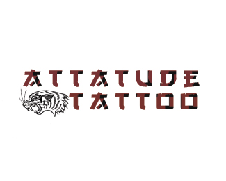
When I approached the client, they told me that they wanted a logo designed in either Classic Americana style, or a tradition Japanese style. After seeing the inside of their shop, I noticed that they had a lot of Japanese style decorations, so I decided to leave the American style out of it. Unfortunately, due to unforeseen circumstances, I was unable to complete the design within the time limit. This is a mock-up of the design I wanted to do. I will most definitely re-work this logo in the future.
Status:
Unused proposal
Viewed:
1926
Share:
Lets Discuss
I like the font %26 the colors go well together. Maybe if the lion had that same red in a few stripes.
ReplyLove the typography and the colors. The tiger head and the type breaks apart from each other. Maybe add some color to it.
ReplyNot sure how I feel about the typography...the A's bug me a little bit because they look like they were supposed to be T's, it would probably work without that cross stroke on the top of the A. Other than that I think it fits, but I agree with the others, adding a little bit of color to the tiger would make it stand out really well.
ReplyThe type is great but I am not to sure on the Tiger. It almost feels like its stretched. Also not sure if i'm digging the black in the font. Maybe just the nice red and then maybe shrink the tiger a little and add color to it.
ReplyThe Tiger seems out of place.
ReplyI'm not really a fan of the gradient in the text and I really don't see the point of having the tiger there, like the concept though.
ReplyI would switch the tiger with something with more %22ATTATUDE%22
ReplyPlease login/signup to make a comment, registration is easy