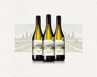
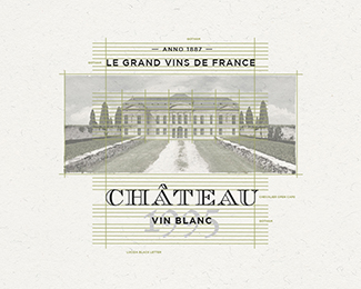
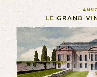
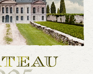
Chateau Vin Blanc
by Dutchworks • Uploaded: Feb. 16 '16 - Gallerized: Feb. '16

Float
(Floaters:
35 )
Description:
a mark for a wine brand
As seen on:
http://dribbble.com/shots/2504049-Logo-Chateau-for-a-wine-label
Status:
Just for fun
Viewed:
5338
Tags:
•
paint
•
bottle
•
label
Share:


Lets Discuss
Wow, all vectors? Impressive!
Replyno way! this is awesome , i wouldnt mind seeing a process video on how you did it
ReplyI imagine this was done on a rather large-ish scale, allowing enough scope for braning and print. Awesome work.
Replyalso this is just for fun, please teach me seriously lol this is like a goddamn painting
ReplyIsn't this just an autotrace of Chateau De Bercy or am I missing something here?
ReplyIt's gotta be a live trace, right? Look closer at the Behance link.
Reply@cream5 so your saying this is too good to be true
Reply@Supamario No, I just think it makes sense to simply autotrace it if you need a vector version of a painting effect given its for a label and labels likely will only be used on a smaller scale. If at all they decide to use it for signage/large scale, then its gonna pose issues if its autotraced because of botches of colors that don't blend like in a painting. You could totally redo this without an autotrace using a gradient mesh to get that blend effect but it would be overkill for a logo given there'd be too many colors and your printing costs would go through the roof.
Replygood research Abi.
ReplyI appreciate the good vibe. I made it just for fun so i hope your'e not to critic about it. (-; There is no secret how to make this. What i did; i created a new scene in PS., trace it and re-done the painting in AI with some coloring, shadows, lightning, depth, scale, etc. etc. I used a lot of different brushes for this. With this brushes i try to create a quality mark with a lot of fine new detail. Just to make it more uniek and for better closer quality. So basically i finish to mark with two layers, the picture i created, and the brush painted layer. Finishing that i used a type what was matching mark, and so it was done. You can do it to (:
ReplyI wanted create a fresh painted mark for a wine brand and i find out that this was the way to do it. I hope you like it, if not, please don't kill me for that! (-; cheers
I also finish a new 'just for fun' project. This time i tried to create much more details design. You can see how i done it. Let me know if you like it. I try to learn everyday. www.behance.net/gallery/33553759/Logo-De-Hoge-Veluwe
Replyagreed^^^^^^!
Replywow, photorealistic
Replysuper nice color blending!!
ReplyPlease login/signup to make a comment, registration is easy