Description:
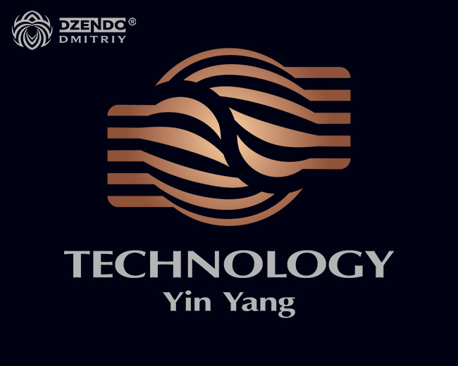
The Yin Yang Abstract Logo is inspired by the ancient philosophy of balance and harmony. The concept merges two opposing forces that coexist and complement each other, symbolizing unity in duality. The abstract design is a perfect representation of how technology and nature, seemingly opposite, come together to create something greater.
This logo is meticulously crafted with smooth curves and sharp lines that create a sense of movement and energy. The careful balance between the contrasting elements represents the dynamic interaction of opposing forces, while the clean, minimal design ensures legibility and versatility in any context.
The Yin Yang Abstract Logo stands out due to its modern, timeless design that embodies strength, balance, and innovation. It’s perfect for industries looking for a sleek, high-quality logo that represents a strong identity and a harmonious approach to business.
As seen on:
instagram Dmitriy DZENDO
Status:
Unused proposal
Viewed:
1809
Tags:
balance logo
•
technology logo
•
abstract logo
•
Yin Yang logo
Share:


Lets Discuss
Please login/signup to make a comment, registration is easy