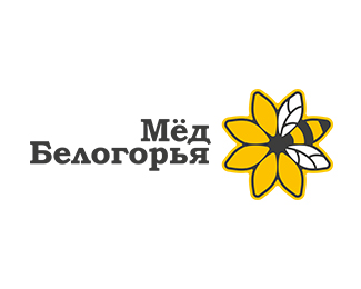
Description:
Belgorod's Honey
Status:
Client work
Viewed:
3588
Tags:
#мёд #белогорье #белгород #honey #Belgorod #bee
Share:

Lets Discuss
I like how you fit the Bee in the design.
ReplyOh really great use of the same shapes. Awesome visual alliteration.
ReplyI did a similar bee/flower combo not too long ago.
ReplyThe same concept was used for the BeeBank logo:
Replyhttp://designspiration.net/image/418627770976/
It has been my opinion for a while now, Russia has some amazing logo designers. Many, happy to say, here on the pond.
ReplyAnd here's mine, though it went unused so no worries: https://dribbble.com/shots/1736066-Unused-Lehi-Logo-2?list=users&offset=16
ReplyBoth good. I do, however, prefer the simpleness in Samdemastrie's I must admit.
ReplyThanks Nido. However, different clients, different design problems, different creative briefs = different solutions.
Replyty all for cooments! I don't think that this logo shoot!)
ReplyPlease login/signup to make a comment, registration is easy