Description:
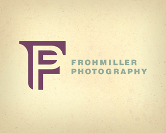
Logo for a photographer using his company initials. I enjoyed and took advantage of the accidental serrif that was created by the upper right side of the “P” eating into the “F's” upper right section....that's why I mimicked the found serrif on the upper left side of the “F”. This ID system will ultilize the two muted ink colors on a natural-colored, fibrous paper.
Status:
Nothing set
Viewed:
9039
Share:




Lets Discuss
I'm looking for a suggestion on a possible body copy font that would match well with the accidental seriff on the logomark...my knee-jerk idea was Clarendon...let me know your font ideas...the phone numbers, address line, etc. will use it. Regards, Larry
ReplyClever solution. It would be nice to see the 'F' in 'FROHMILLER' customized to match the 'F' in the icon. Maybe simply adding the serif would look good. Also, in my opinion, it might look better if the colors swap. This way the icon isn't so 'in your face' allowing the wordmark to stand out a little more. These are all just nit-picky comments. This looks great as is!! :-)
ReplyLarry, I think clarendon would be a nice suiter. Or possibly Lublain Graph (SP?)
Replynice icon
ReplyCool!
ReplyThat's great. I love the accidental serif as well, although I find the bottom left of the F very odd... there's no other curved corners on the font and it seems out of place. I think it would look better to reflect that serif down there as well.
ReplyThanks everyone for the comments! Good stuff! If anyone else has font suggestions for the body copy...address lines, phones, etc...just let me know.
ReplyHi ryantoyota...the bottom of the F is actually reflecting the inside shapes of the P...I tried the serrif there at one point...it just seemed like too many serrifs...like too much water in Koolaid...just didn't taste right...or seem unique enough...that's why I landed where I did. Thanks for the comments.
Replynice mark. I like it.
ReplyIt would be nice to see the 'F' in 'FROHMILLER' customized to match the 'F' in the icon. Maybe simply adding the serif would look good. Also, *regards**%3Ca href%3D%22http://www.bitzli.com%22%3Eschweizer internet%3C/a%3E*
ReplyIt would be nice to see the 'F' in 'FROHMILLER' customized to match the 'F' in the icon. Maybe simply adding the serif would look good. Also, *regards**%3Ca href%3D%22http://www.bitzli.com%22%3Eschweizer internet%3C/a%3E***http://www.bitzli.com*
ReplyPlease login/signup to make a comment, registration is easy