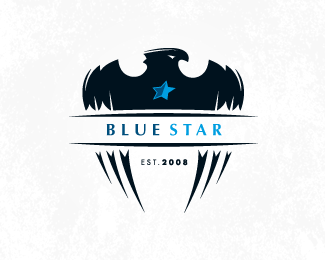
Flaming Eagles
by Desert • Uploaded: Feb. 11 '08 - Gallerized: Feb. '08

Float
(Floaters:
24 )
Description:
Logo for a 5-a-side football team. Colours, text and general design are still not complete. I am looking for opinions. I want to maintain a football badge style but with a modern, high impact treatment. Comments appreciated guys :)
Status:
Nothing set
Viewed:
13407
Share:


Lets Discuss
I would have to agree with the comment on the football, kinda just floating there, maybe incorporate it some how, under the flames as though the ball is on fire, or just some way that fixes it to the rest of the piece... just an idea. **The Orange does not strike me as Edinburgh, I tend to go towards dark grays with Dark Reds/or Dark Blues (always so cold there).... but thats a personal interpretation**Really nice work though. Love the Eagle, reminiscent of The Batman Icon.**Good Luck!
ReplyNice mark..%0D*Do something for 2008. %0D*Maybe make it comes under with edinburg or try to find someother place.
ReplyCheers guys. Yeah, the ball isn't quite in keeping with the rest of the logo and probably does need a bit more integration.*In terms of colours, I think they going to choose orange to limit the clashing with other teams jerseys. White jerseys with coloured shorts is another option though.
ReplyI love it, but I agree with Rambal, I think something needs to be done with the 2008
ReplyI agree with lucidity, 2008 is sticking out, it makes the overall shape of the logo awkward. I like everything else though. Very original.
Replyit definitly rocks. I also like the placeing of the 2008.*Will you print it, or will it be stitched? I'm not shure if the thin ends of the flames and the line above the eagels head will work out fine?
ReplyHey, I really like the feel of the logo but I agree with others - the ball doesn't quite fit in. Did you play around with bringing in some talons grasping onto it? That'd help mask some of the ball, you could even play around with having it half deflated in the talons as if it'd been popped by the claws.
ReplyI'd say it might look better to get rid of the ball altogether and put 2008 in it's place. You really don't need the ball to make your design come across and this will give it better balance.
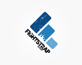
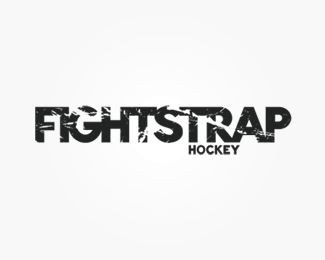
ReplyNewbie here...**Overall, I like the mark. I agree about the ball floating...and the placement of the year. I think the comment about replacing the ball with the year is a good one. **One other thing that doesn't sit right with me is the flames. The style of them doesn't quite fit? Maybe simplify it a bit? I think it looks a bit busy/small in comparison to the lines of the wings. Plus, I think you used the exact same flamage on the FIGHTSTRAP hockey logo. Gotta watch for that kinda stuff %3B)**Like I said...overall, nice mark
ReplyThanks for all the comments. I'll take everything into consideration and look to making some improvements which was the idea.**jw_designer: Good spot on the flame. I originally used it as a rough example, but stuck with it for now as it was just a draft. Something I will definitely replace ... and in a more fitting style.
ReplyPlease login/signup to make a comment, registration is easy