Description:
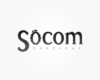
With a clear idea of what I wanted from this concept, I created a custom type for the "Socom" part of this logo. As it was to represent an online store selling tactical gear (air soft, paintball) I felt the transformation of the 'O' into a recognisable military symbol (a grenade) particularly appropriate.
Status:
Nothing set
Viewed:
2187
Share:


Lets Discuss
The grenade isn't instantly recogniseable, even after reading your rationale. Perhaps filling the centre of the 'O' and continuing the 'grooves' of the grenade right through the shape will make it easier to recognise.
ReplyPlease login/signup to make a comment, registration is easy