Dorigenn
by David_7912 • Uploaded: Sep. 13 '12 - Gallerized: Sep. '12

Float
(Floaters:
26 )
Description:
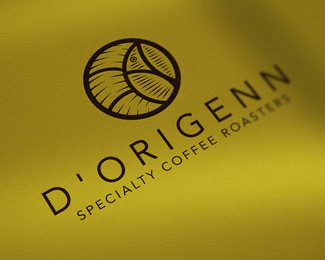
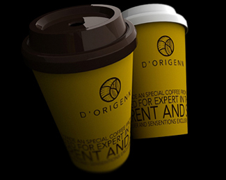
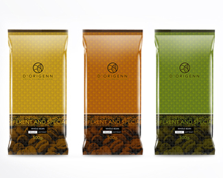
This project like most required a lot of research and analysis on everything in creation of the symbol, in early 2010 the company gave the green Colombian DORIGENN for visual presentation of the proposals of the brand, there were several proposals to maintain the concept 3 month and the company chose the macaw, the project took about two months and then presents it to you home after a year and 9 months after leaving the market, I hope you like it, greetings
Att: David Espinosa / Graphic Designer
Status:
Client work
Viewed:
7195
Tags:
Espinosa
•
David
•
Colombia
•
Coffee
Share:

Lets Discuss
Very interesting mark. Always nice to see packaging as well
ReplyYes agree. A very unique but fantastic mark. And your packaging presentation compliments the logo very well. Since you're open to critiques, I wouldn't mind seeing a few changes. The kerning could be a little tighter between the D ' O. I know its probably accurately spaced but I think you can get away with a bit of artistic licensing there. Lastly, give the tag and the name a little more breathing room. Hope I didn't offend because I just think this is superb work.
Replywhat is?
Replyyou are so talented. where do you get your ideas from.
ReplyWow... very good one mate!. I really like the packaging too, but the logo is really good in itself.
ReplyDefinitely saved!
Very nice design work, real quality stuff.
ReplyPlease login/signup to make a comment, registration is easy