Float
(Floaters:
1 )
Description:
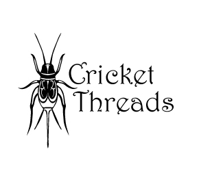
This logo is for a line of child's clothes
Status:
Unused proposal
Viewed:
844
Share:


Lets Discuss
I think the company name and the idea of having a cricket as a mascot are good for a childrens clothing line. However, your execution is far from child-friendly. Your cricket is way too realistic and borders on being downright scary (I thought it was a spider at first). When designing a logo you really need to think of who your target audience is and the types of things they respond to. I think a more cartoon-like cricket would suit this logo much better. Good luck.
ReplyI had the same challenge with two projects, to make the bugs more friendly although I'm not that great at cartoon-like characters.*http://logopond.com/gallery/detail/57272*http://logopond.com/gallery/detail/58331
ReplyD,*I agree with sdijock, as we said in class, it's too anatomically correct and as sdijock said far from %22child-friendly%22. I do however think that the font is a nice choice that fits the company well. Maybe if you stylize the cricket it might help make it %22not so scary%22. Let me know if what else I can do to help you with this project. Keep up the good work D!
ReplyI agree with the above said, the illustration could have been taken straight from a biology book. If you want to make this more appealing to kids, choose another angle, not from above, so you can show the face as the most prominent part. There's nothing that humans respond to more than eyes and lips / a smile. Also, make the proportions more closer to those of a human being: larger head, big eyes and shorter legs.
ReplyPlease login/signup to make a comment, registration is easy