Description:
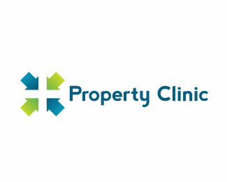
Logo developed for a company that has been in property management for a couple years and have first hand experience as developers and landlords. They have also developed and led courses
on project management for a number of blue chip companies. The logo was created using arrow shapes as houses pointing each other forming a cross. The elements represent how parties can come together and offer a solution.
http://www.behance.net/gallery/Property-Clinic/2954701
Status:
Client work
Viewed:
2332
Share:

Lets Discuss
this is nice. I wonder if by cutting out a door-shape, it would distinguish those shapes as houses instead of arrows.%0D*%0D*I like the typeface
ReplyThanks Erik!...I have a version with the doors, I'll try to upload it, right now my customer and I are trying to define the colors palette, since they want to keep the colors they had which are darker than the ones we used in this version...Thanks a Lot!
ReplyPlease login/signup to make a comment, registration is easy