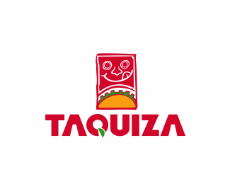
Description:
In Mexico, Taquiza is like a party where you can taste lots of different recipes served in Tacos, basically this is the concept they had in mind.
http://www.behance.net/gallery/Taquiza/2890815
Status:
Client work
Viewed:
10156
Share:




Lets Discuss
Im from Mexico and dont feelit to mexican food jeje. But i ignore of which way sees us in U.S.
Reply@ ClimaxDesigns: should I try to make some arrangements to the font?**@ Oronoz: Yo tambien soy de Mexico jeje, sabes el problema radica en que en estos momentos estoy como que atorado en el concepto, crees que un manejo distinto de color ayude?**Thanks
ReplyPaisanooo :D si creo que el color de la tipo esta muy magenta. Tal ves intentando con otra gama de rojos. Por otro lado siento ke la tipografia esta muy autoctona no crees?
ReplyTratare de variar en una gama de rojos, ya aprovechando tu nobleza XD, alguna recomendacion de tipo?.....muchisimas gracias..
ReplyThanks for the feedback guys, it helps more than you think.....:D
ReplyPues yo utilizaria la anhedonia que siento que va mas con la ilustracion. O la BluePlateSpecialSW para algo mas autoctono pero con algunas modificaciones de la tipo. Esa es mi opinion, espero te pueda servir de algo...:P
Reply@ Oronoz thank you so much dude, you're so cool helping me to improve this mess :D...gracias carnal XD*@ Climax, ok no more spanish mi amigo. Dou you think it has something to do with the mark?....
ReplyYou rigth climax!!! I think the font its so native, feel like mayan o aztec ruins. I commented a borinagge, that I would use a typography more similar style of illustration...
ReplyIf your audience is in the U.S., I think the type is great. Don't change a thing.**If you are marketing in Mexico or somewhere else, I really have no idea what to recommend. It's a cultural puzzle that my perspective doesn't allow me to even try to solve.**I liked the mark when I saw the thumbnail, but now that I see the full-sized version the smiley face throws me off. All I can think is... SpongeBob RoundPants. I feel bad saying that, because I really like the logo overall. Having no idea what taquiza meant, I could tell what the business was, and I think the approach and style is fresh and attractive.
Replydbenton said:*All I can think is... SpongeBob RoundPants.**hahahaha that's a good one....I never saw it that way...XD
ReplyBorinagge, the type its great! If %22Taquiza%22 is in U.S it is a good typography referring to M%E9xico. If this located in M%E9xico is a nice and modern mexican type.**Tacos!**pd. I'm mexian too
ReplyIt makes me hungry, good work!
Reply@ erifreak, I tried many variations, but after all that, I decided to keep this version, unless my client wants to change something.....the customer comes first, sadly...lol...Thanks Compadre!**@2dispari.....That's nice...Thank you so much...It's supposed to be the first reaction...haha*
ReplyI love this logo, the mark really portrays someone's face about to devour a taco, or two or three or ten lol I'm from mexico too, and I can definitely see the mayan apparel of the type but it makes me like it even more, and as for the color, looks very %22rosa mexicano%22 to me :D Me encanta
ReplyPlease login/signup to make a comment, registration is easy