Description:
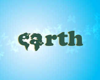
Beginning sketch for new clothing line. I wanted to integrate the globe with the letterforms...turns out it was harder than I thought it would be...
Status:
Nothing set
Viewed:
2035
Share:


Lets Discuss
Keep going! don't give up I think it looks cool!
ReplyYeah, has great potential. Lose the background and shadow and carry on honing out that map.
ReplyI agree. This has great potential. I think firebrand has the right idea. Cheers!!
Replythanks guys, the top of the letterforms is the hardest, but im still trying to get it all worked out...
ReplyDon't forget Australia :)
Reply...and i was waiting for someone to say that. haha
ReplyPlease login/signup to make a comment, registration is easy