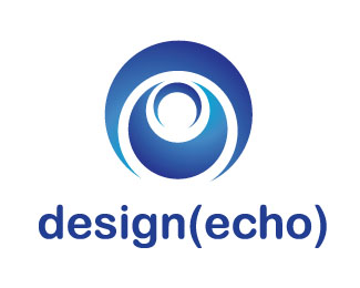
Description:
This is my second version on the logo. I am trying to make it modern and sophisticated. But i need some advice on how to further it or if this is a good direction to go with. Thanks!
Status:
Nothing set
Viewed:
927
Share:

Lets Discuss
Like I recommended before, I REALLY think the type stands better on it's own. why the background button? If you really want critique, there is a good start. I also think another bracket to each side might add help to emphasize more of an echo, but this concept may have actually been done on the word echo before? My 2 cents.
ReplyPlease login/signup to make a comment, registration is easy