Description:
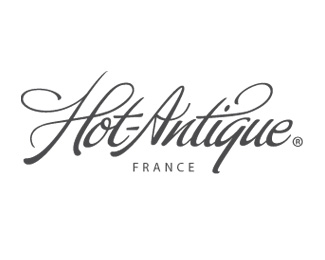
This is a logo proposition for a store that sells French Apothecary Jars.
The owner did not want anything that had to do with Apothecary and/or ceramic as he will certainly offer other/different products that are not in ceramic or related to apothecary.
I'm actively looking for critiques. Thanks.
Status:
Nothing set
Viewed:
1275
Share:
Lets Discuss
I really like the typeface and simplicity of this one. If your-man doesn't want to have any reference to a product as such, then this works. What font is it by the way?
Replyi noticed the dash in your mark, but you listed the logo name without the dash. would be nice without it. love the typeface.
ReplyThanks Madebylime and Gyui for the comments.**The font is %22buffet script%22 from Sudtipos. But keep in mind that the typeface has been modified quite a lot to get what you see know. **This logo might seems very simple... simple as typing a name with a fancy and well designed font. However, it is much more than this. I really spend a great amount of time working on it. I have 37 different versions before this one! Just from working on tweaking, modifying and adding to the type untill I was getting closer to what I wanted. There is still a little something I'm not totally happy with this logo. But I've got the feeling this is due to the great amount of time I've spent staring at it. This is mainly why I submited it here today, so I could get your feelings about it.**Thanks for the critiques... and keep them coming!**PS: My mistake, the dash is needed. I simply forgot to add it to the title when I submited the logo for review.***
ReplyThis is very nice! I wouldn't change a thing! People that didn't try this style of logotypes don't really know how hard it can get to make one. Well done!
ReplyNice. And I get what's involved.
ReplyJust to clarify, when I said simple, I didn't for one moment think that all there was to it was typing away. It was in reference to the fact that it is grey on white with two typefaces. I appreciate you've put a lot of work into it ... hence why it looks so good.
Reply@Madebylime: No offense taken. I'm so used to having client think that it's as easy as finding the right font or right clipart that I forgot I was talking to other logo designer. %3Bo)**As for the simplicity, that was just what I was looking for... something simple, light, yet stylish with a touch of personality.**
ReplyYep, its definitely ticks all of those boxes. Good stuff.
Replynice one !!
ReplyPlease login/signup to make a comment, registration is easy