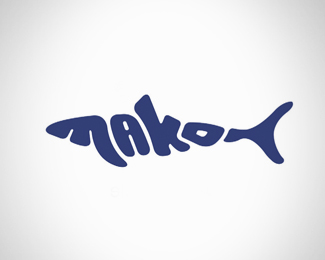
Description:
Still my favourite logo to date, I created this back in 2004 when I worked for Mako Creative. It was originally intended for concept artwork and for promotional material, but since we liked it so much we started using it as the main logo. Mako Creative are a well established creative and marketing agency based in Llay, Wrexham. They do not specialize in anything in particular as they cover all aspects of creative art from corporate branding to comic illustration for the likes of Marvel.
As seen on:
www.makocreative.co.uk
Status:
Client work
Viewed:
3774
Share:


Lets Discuss
I see makoN %3B) but looks nicely.
ReplyThank you, you are right i suppose. Although 95%25 of the time the logo was used with text.
ReplyI see makon to, but never the less I like it.
ReplyI have also difficulties reading it as I think that the tail is also a letter ... if the tail was painted in other color or lighter/darker blue, it would be easy to read it right**still, good work
ReplyPlease login/signup to make a comment, registration is easy