Bear-01
by DANIELKIM • Uploaded: Oct. 03 '11

Float
(Floaters:
16 )
Description:
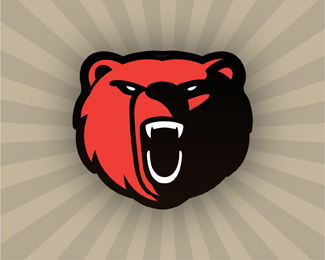
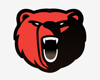
Could you choice what is better one? no1 and no2
Status:
Client work
Viewed:
9506
Share:
Lets Discuss
I prefer this one. The other one looks sad.*
ReplyI like the fact that it does not look like all the other %22sports bear%22 logos. Clean lines. Don't care for the square neck though.
Reply01
Reply01. But I agree with Mike, the square bottom is not necessary. I think just rounding it off in the rounder shape that the neck is already forming. cleans it up for me. Fine looking piece of work you have going hear. I like it.
ReplyPlease login/signup to make a comment, registration is easy