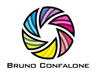
Bruno C. Logo Design
by CubeDesigns • Uploaded: Oct. 01 '11

Float
(Floaters:
0 )
Description:
The second concept we designed for Bruno's logo.
Photography company
Status:
Work in progress
Viewed:
3451
Share:

Lets Discuss
I think this logo is too busy (confusing).*Try making it as simple as possible.*For example I would remove the lines and make type smaller to nicely fit in center.*Mark looks good but I must say I saw similar marks too many times, try to make it more original. Maybe make it part of lower %22b%22 letter (B for Bruno).*I hope this helps.*Good luck!
ReplyI forgot to say that I think this one has more potential than other one.*Cheers!
ReplyPlease login/signup to make a comment, registration is easy