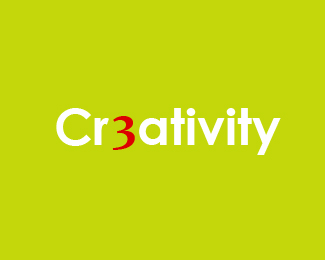
Description:
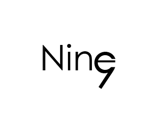
This is a personal logo for my website. I am constantly changing ideas and I would appreciate if I can get feedback on this particular logo.
Status:
Client work
Viewed:
1312
Share:


Lets Discuss
How is the 3 relevant? And seeing as that's really the only visual twist, that might need to be clearer.
ReplyGotcha. Well, it's certainly visually arresting. With your explanation, it makes a lot more sense. Also, I very much like your Cycle mark, it's simple and cool. Good work.
ReplySure, I would say experiment with different typefaces (is this Futura or Avant Garde-Demi?), maybe something a little newer and less common. Also, try all uppercase so that the bottom of the 3 hits at the baseline with the other characters. What type is the 3? It's modified, right? I think the 3 is the most interesting element of the mark, for sure.
ReplyPlease login/signup to make a comment, registration is easy